Typeface: HSK Display
Commissioner: Circus
Styles: HSK Extra-Light, Regular, Black
Deliverables: .otf, .ttf + variable format
Coverage: Basic Latin & Dutch
Website: hskwartier.com
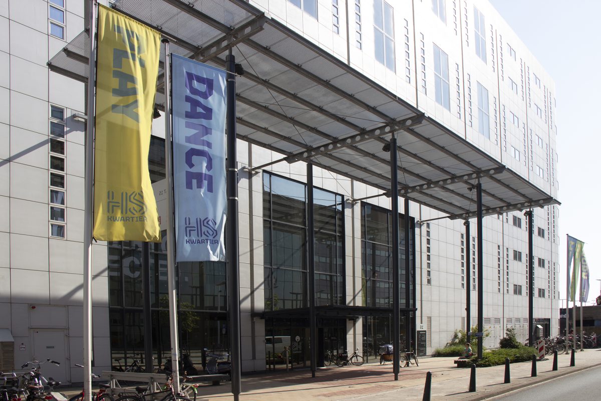
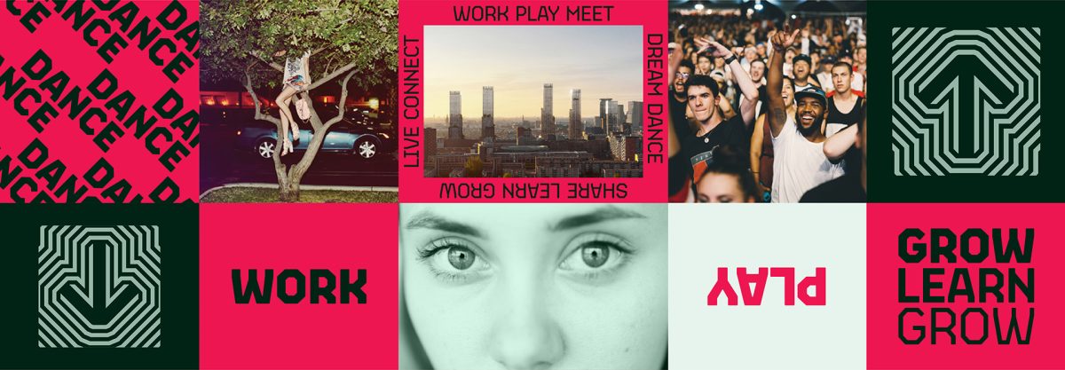
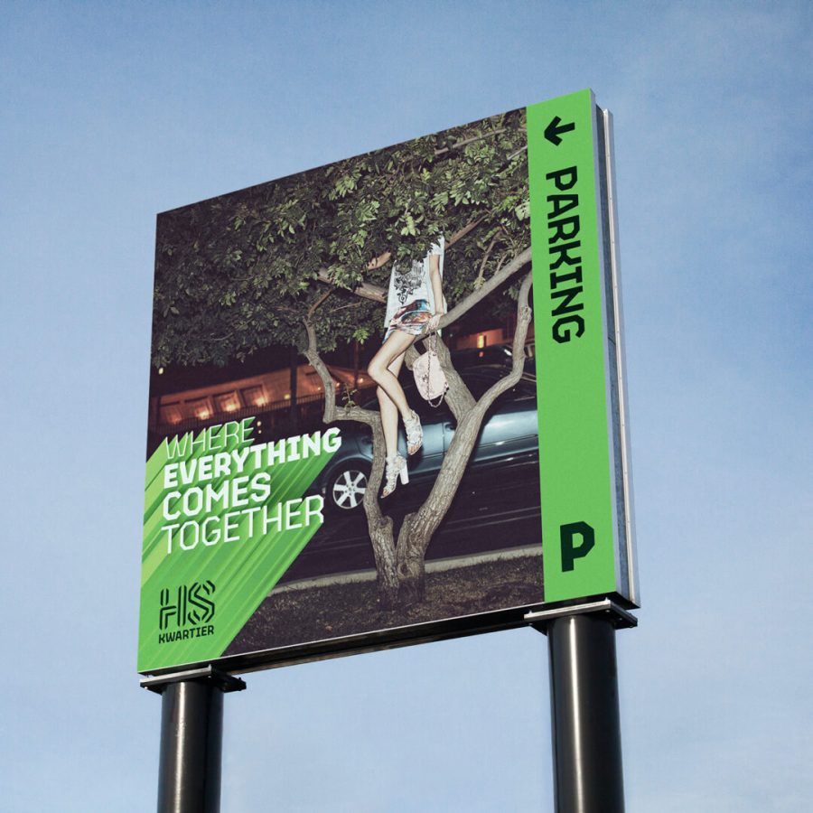
For the up-and-coming Holland Spoor Kwartier, the creative studio Circus developed a progressive and playful area brand. HS Kwartier is set to become The Hague’s most radiant district with an enticing mix of working, living and leisure concepts and facilities covering 90,000 sqm.
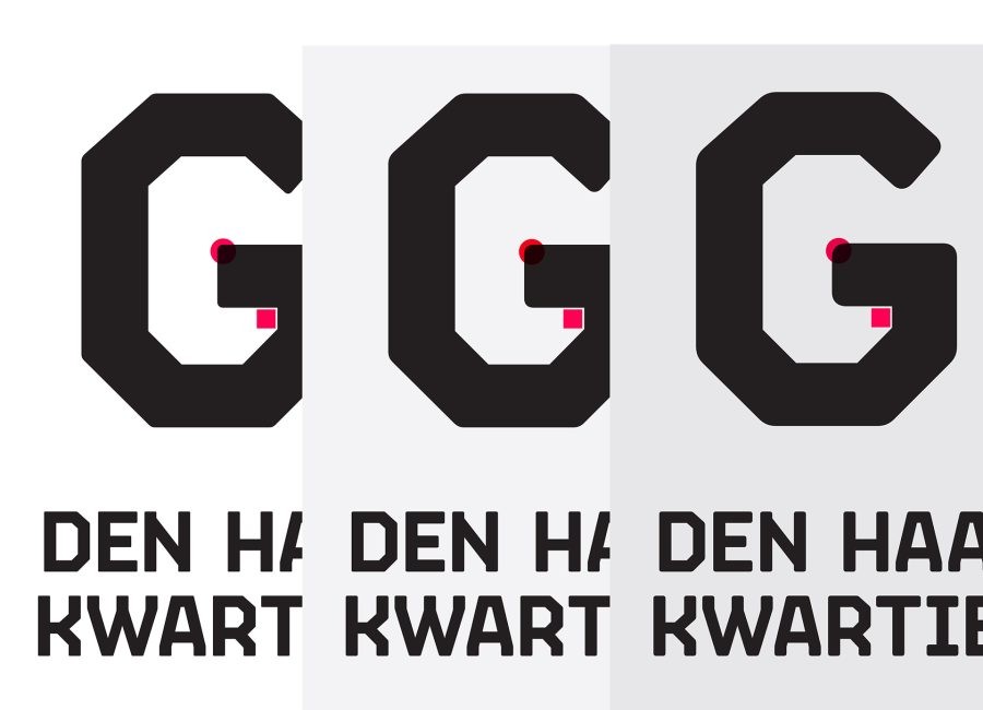
This spectacular urban playground in the heart of The Hague deserved its own “voice”, so it should come as no surprise that the branding project included a bespoke typeface. I was commissioned to help lead designer Martin Cadwallader develop and produce HSK Display font, a variable font that became the face of the neighbourhood.
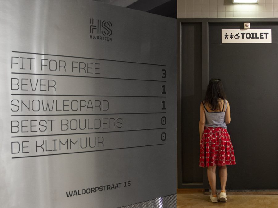
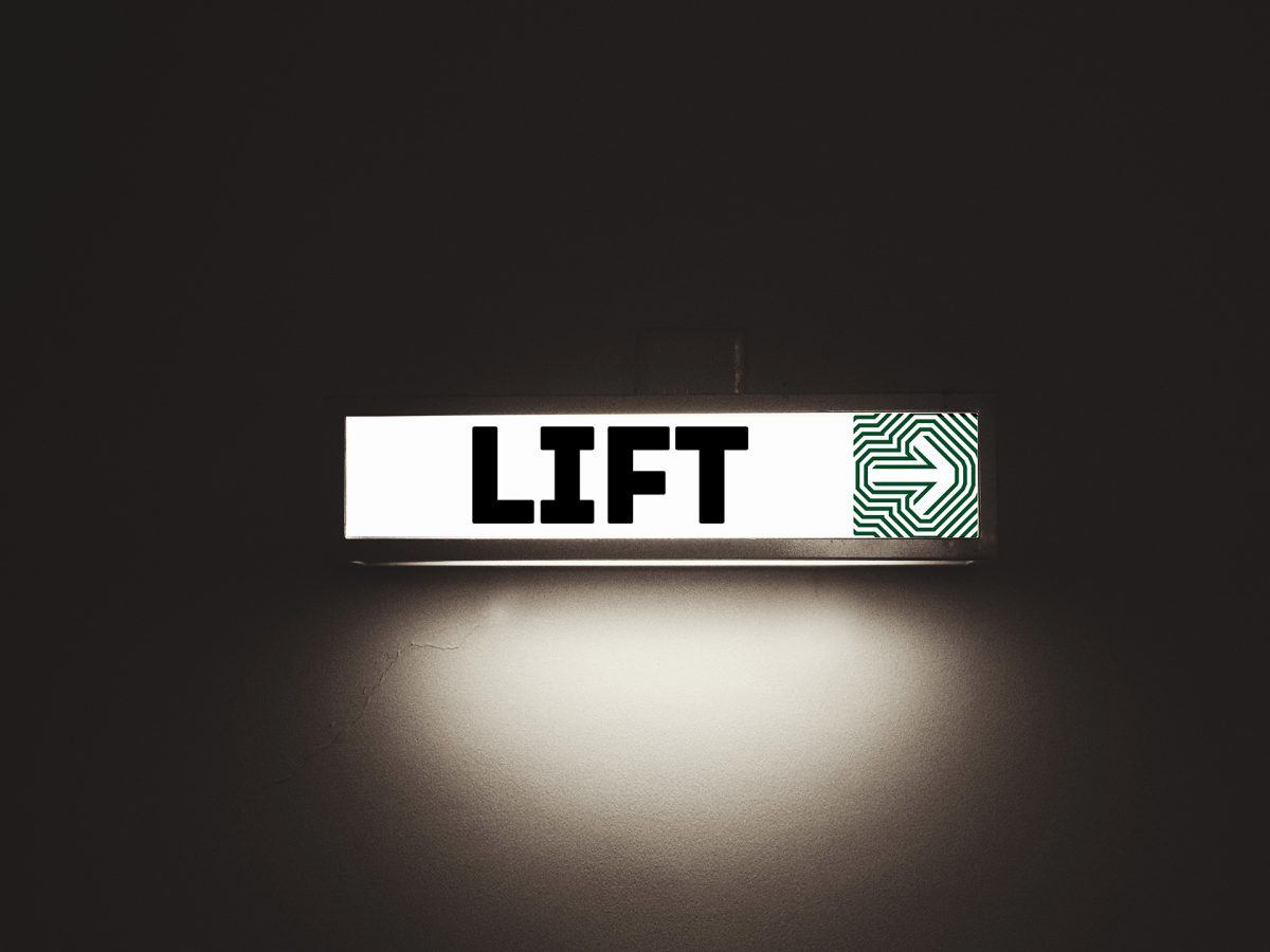
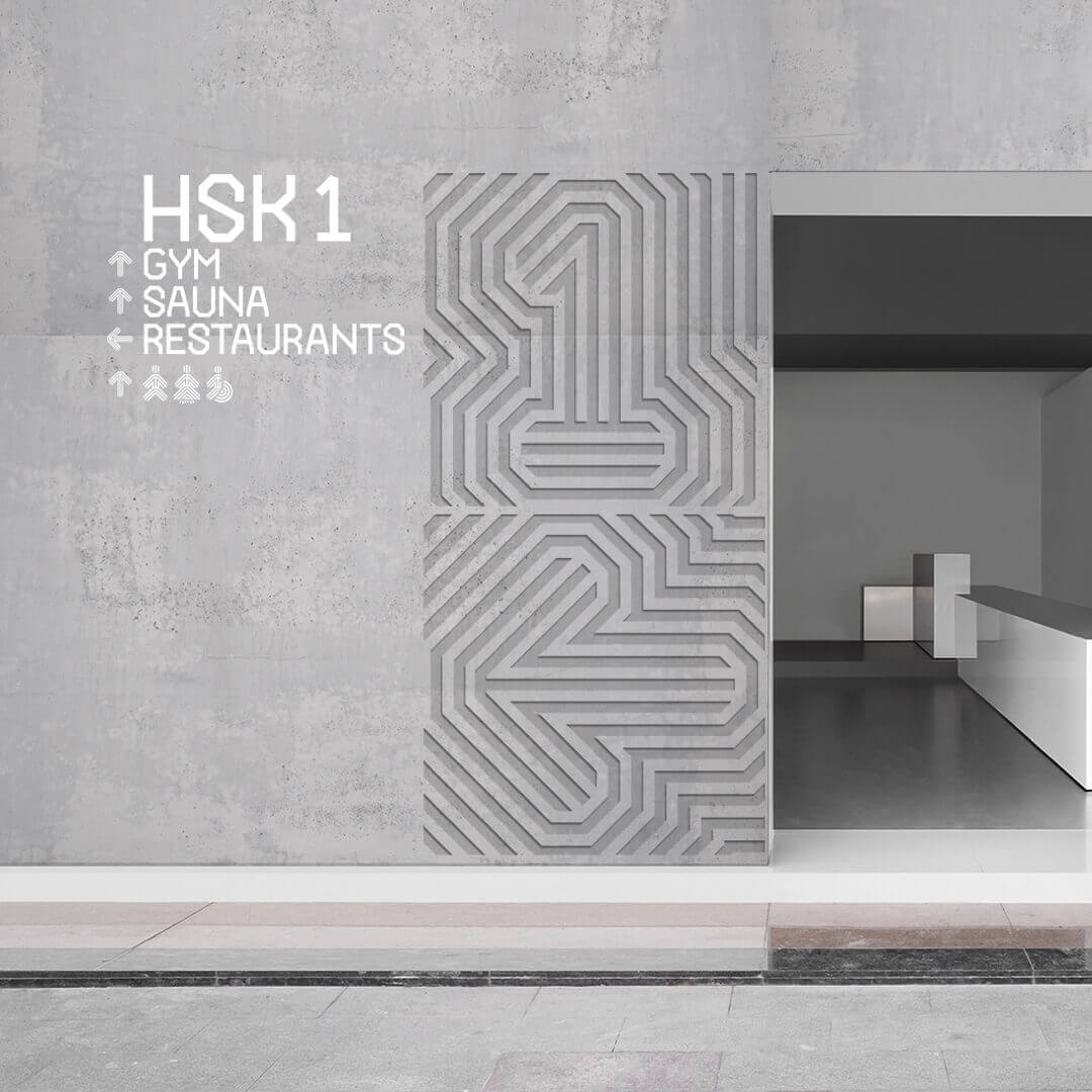
The typeface comes to live and decorates every aspect of the HSK building, from flags, information signs, elevators, banners etc. Because the typeface is meant to be used at large sizes a special part of the brief referred to the tight leading. We took in consideration the usage of Dutch diacritics that were carefully drawn on top of the letters, connecting with the top horizontal stems. That way they allowed for a legible tight leading.
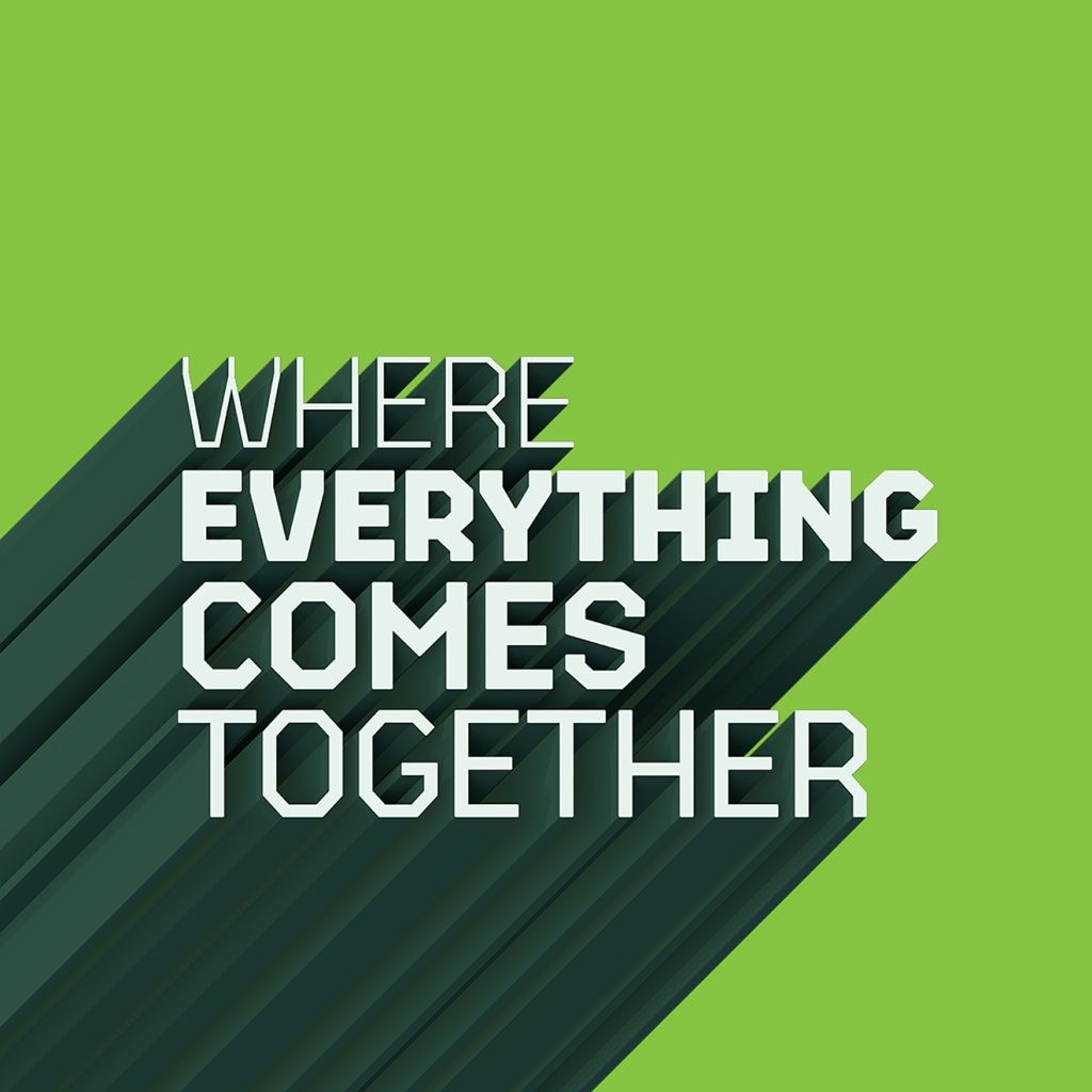
The bespoke typeface was used by Circus in a playful way and together with the color scheme reflects the personality of the HS Kwartier. An unique project where the typeface plays 50% of the communication role, in the same proportion as the usage of images.