Typeface: Aesop
Commissioner: Iwoca & Stupendous
Styles: 1 Style
Deliverables:
.otf, .ttf, .woff, .woff2 + variable format
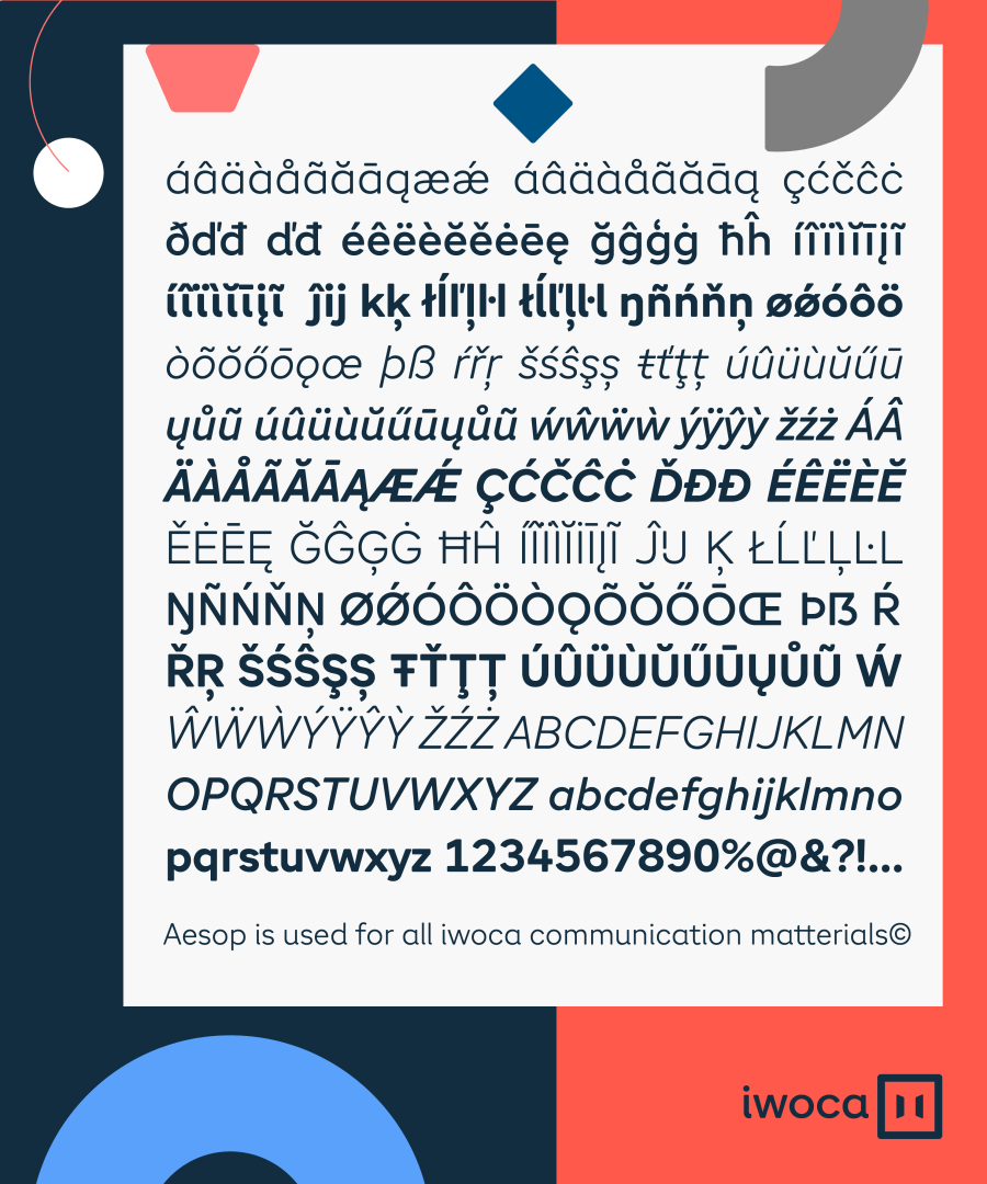
Coverage: Latin Extended
Website: Iwoca
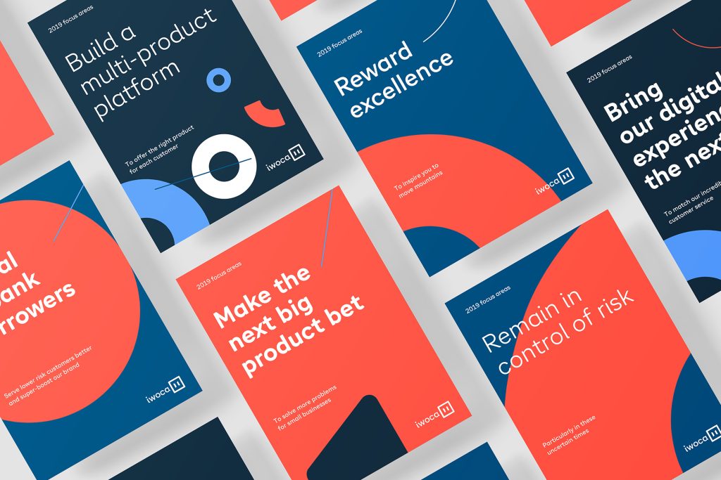
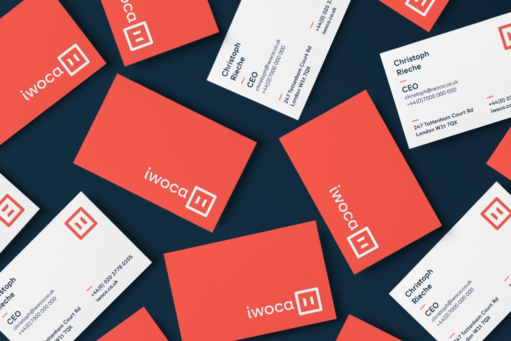
Iwoca was created to help small businesses open doors to new opportunities. The brand image was designed by Stupendous Studio, Quim Marin Studio together with iwoca in-house design team led by Avi Ashkenazi, iwoca head of design and Josema Úros – production adviser.
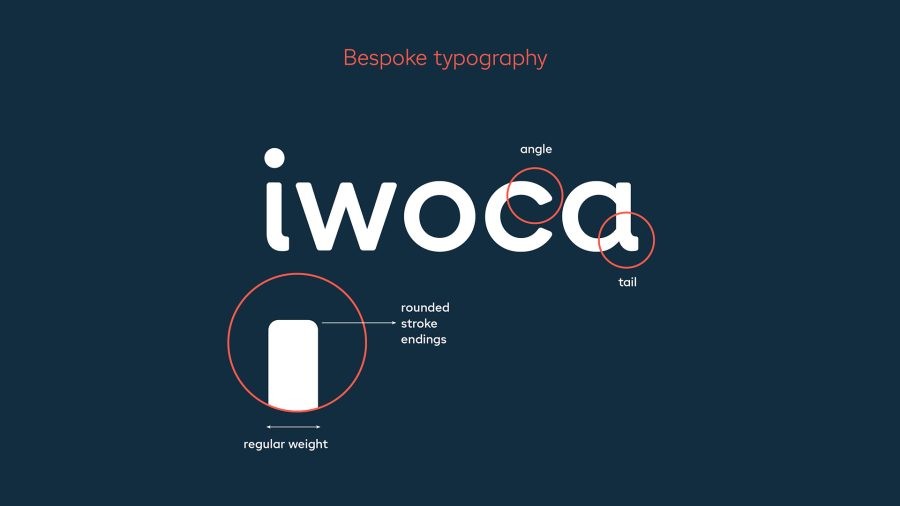
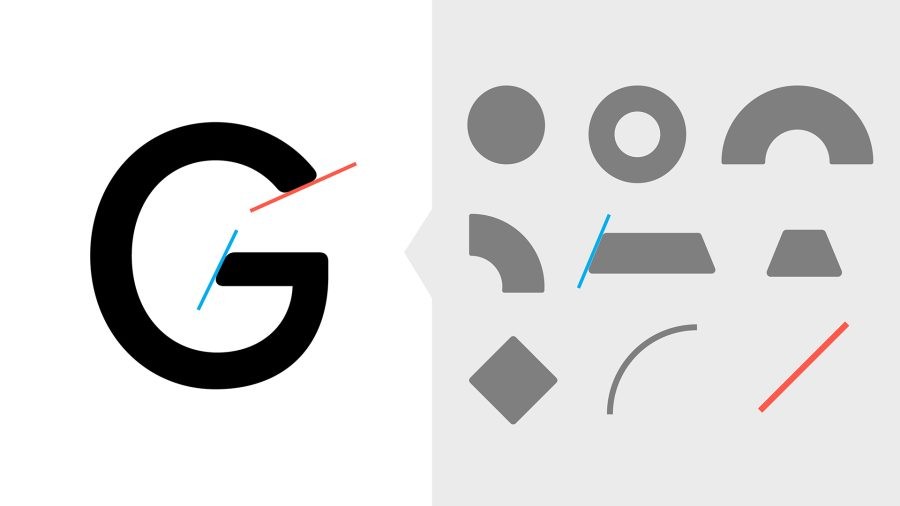
Once the design concepts were set the need of a bespoke typeface arise. The features of the logotype were the bases of the Aesop typeface. However the typeface has a slightly narrower aspect in order to accommodate more text on narrower displays.
The iwoca identity elements were influenced by the work of Wassily Kandinsky. The geometric shapes and angles are reflected in the way the typeface was designed.
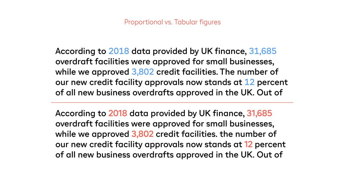
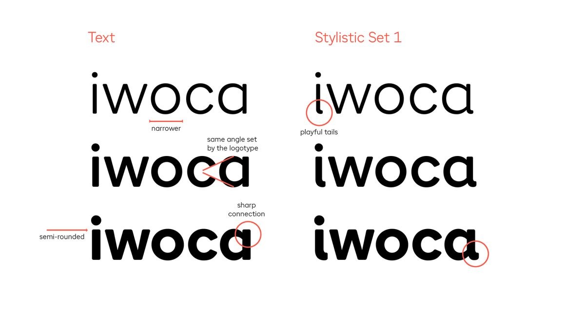
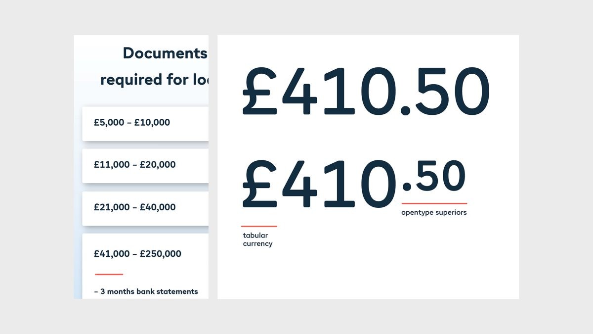
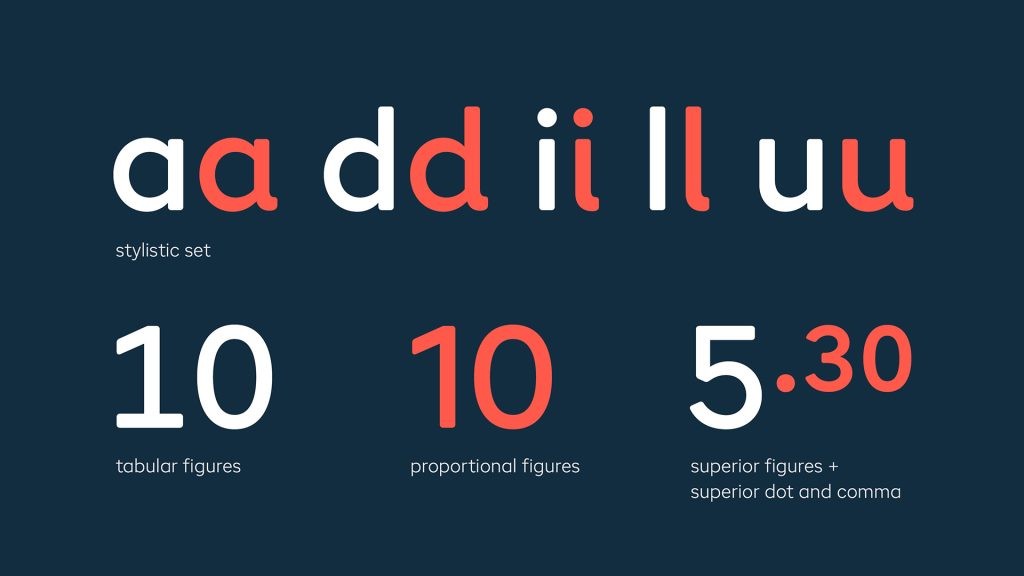
In order to give more play and versatility to the brand’s voice a set of alternate characters were drawn. Due to the large usage of numbers on the website and other communication materials special attention was given to the figures. Aesop contains tabular lining figures and proportional lining figures as well. The superiors numbers were also carefully designed for decimal usage, together with period and comma.
Later on, italics were added to the family for more versatility in the brand communication materials.