hello@sabinakipara.com © Copyright Sabina Chipară

Mobirise


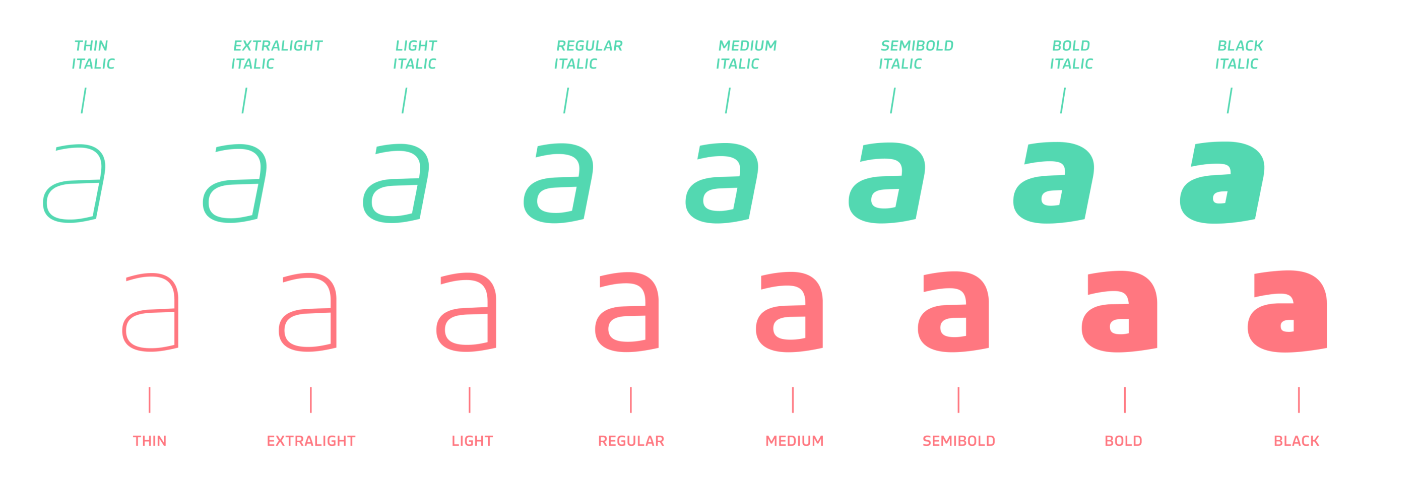
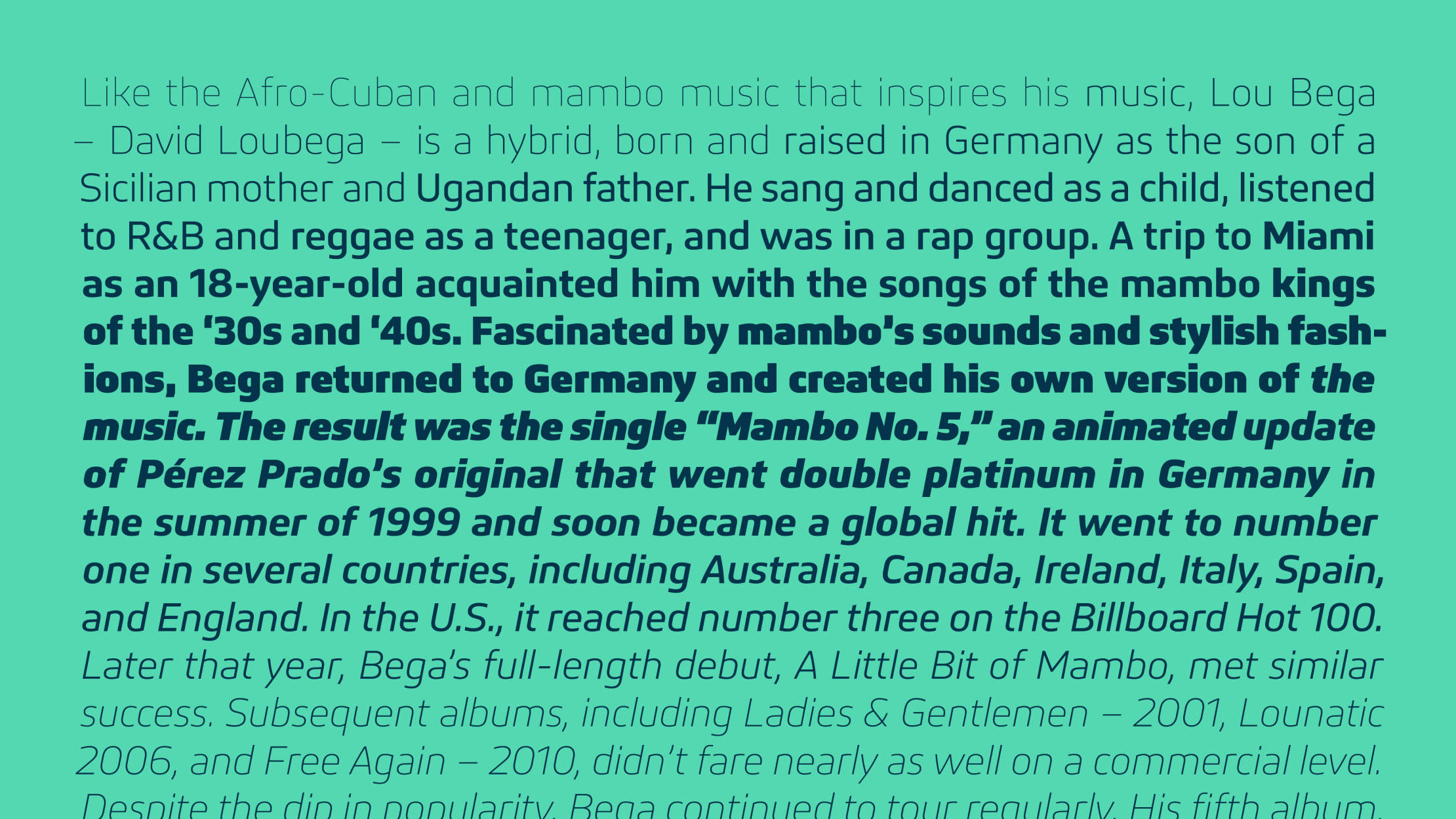
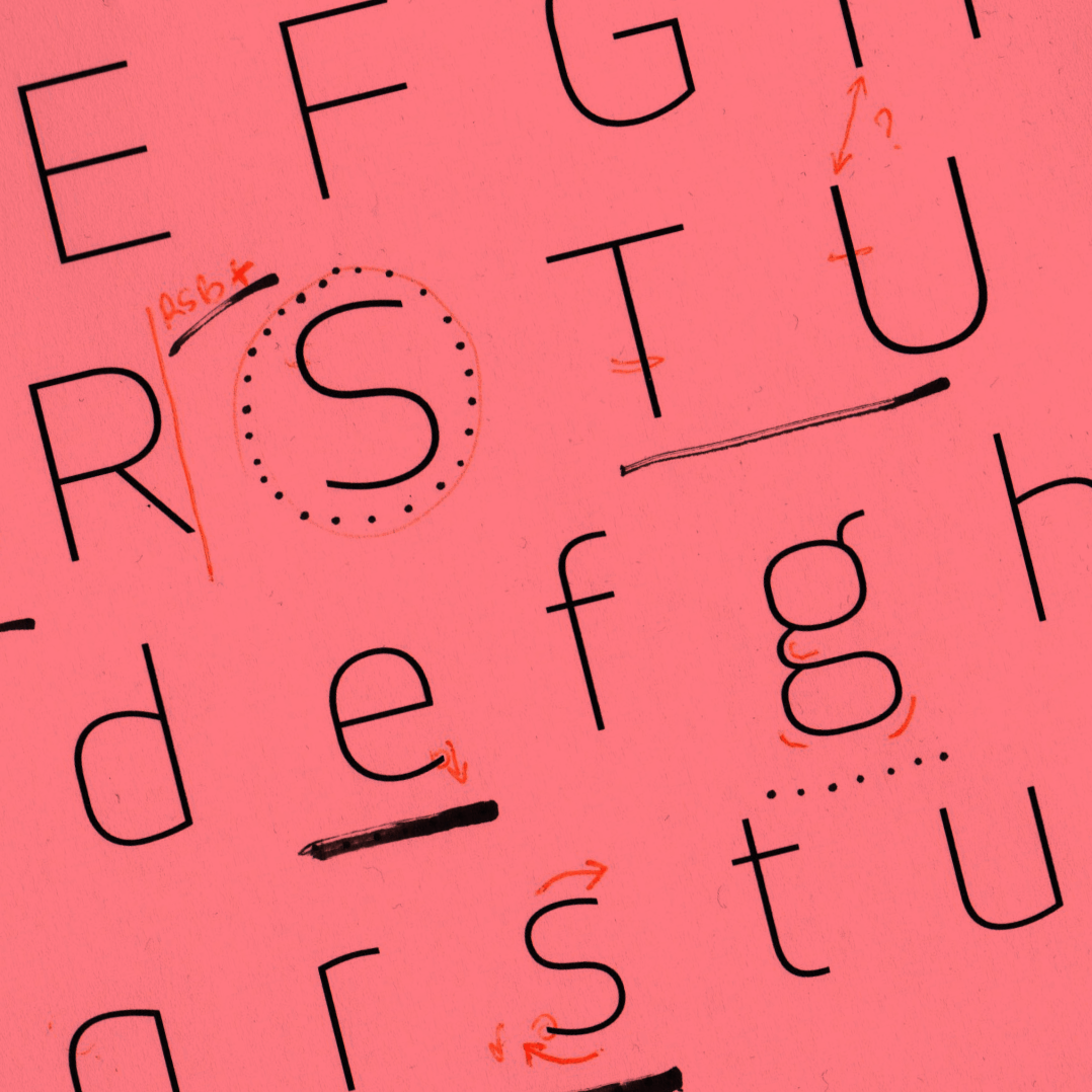
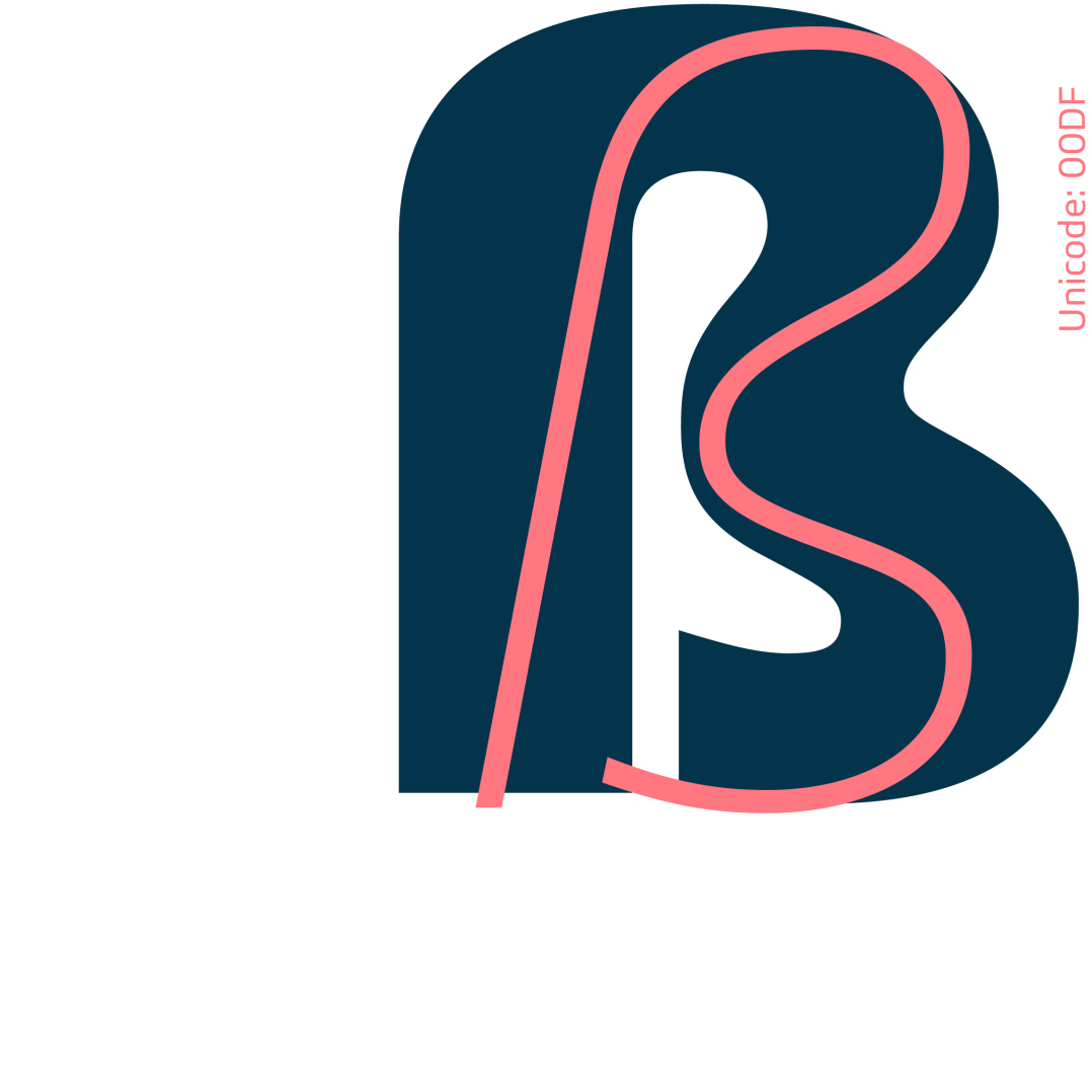
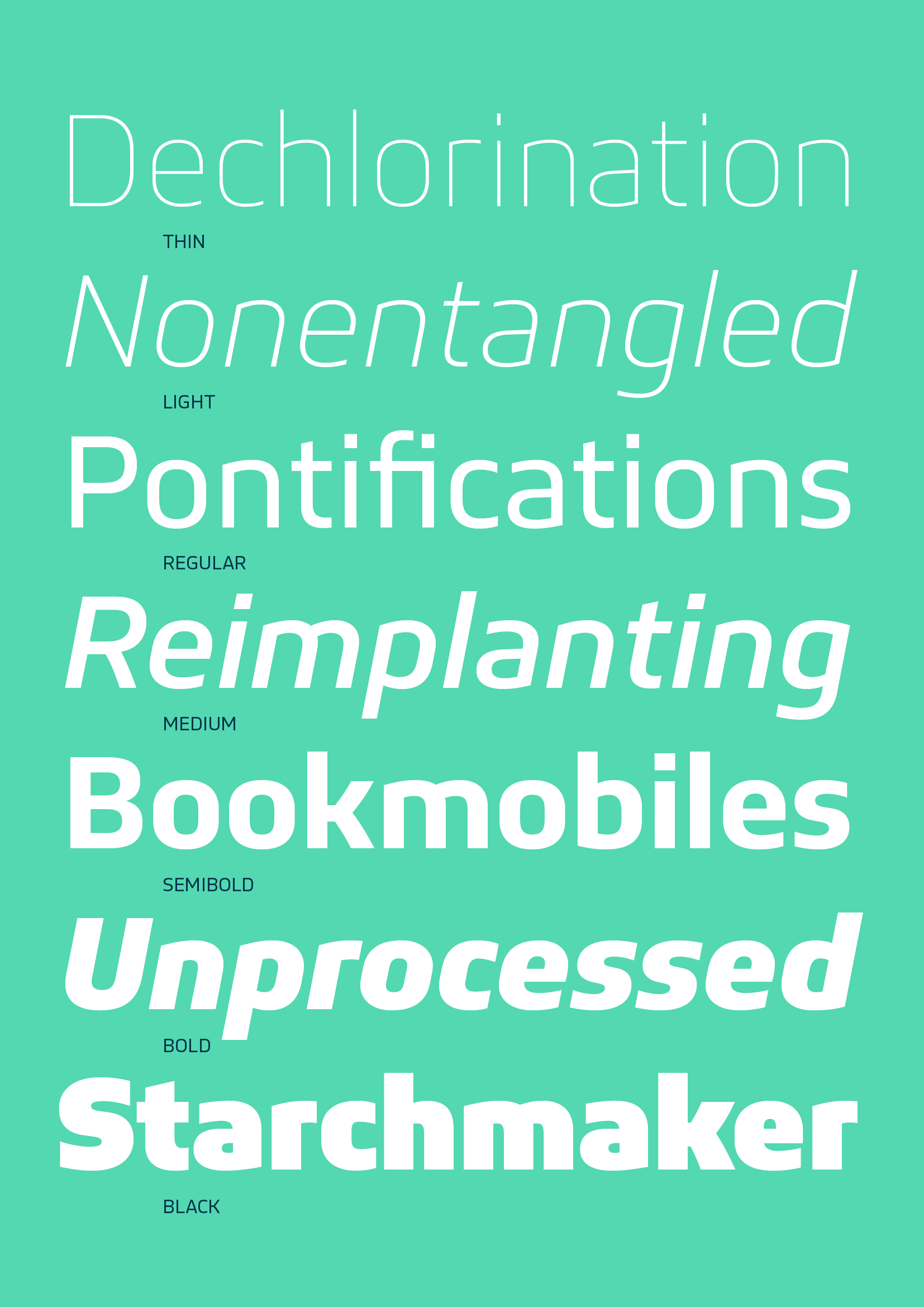
Bega is a simplified sans serif typeface. Formal reduction plays a strong role in its design. This is most visible in its ‘spurlessness.’ The visible strokes (or spurs) have been eliminated from the letterforms that would typically feature them. The lack of spurs in Bega is most-clearly visible when you look at the top-left corners of letters like ‘m’, ‘n’, and ‘r’. 

Bega was designed in collaboration with Diana Ovezea.

Mobirise
Mobirise
The Bega family includes eight weights, which range from Thin through Black. Each weight has two fonts on offer: an upright font, and an italic. Bega’s italics are obliques; their letterforms are slanted. The strokes of Bega’s letterforms all appear to be monolinear; however that doesn’t mean that Bega is without contrast. Thanks to the family’s large number of weights – eight – you can combine two or more of them with each other to create headlines that exhibit quite a bit of contrast! 

Mobirise
Mobirise

Each of Bega’s fonts includes a full range of numerators and denominators, to use when typesetting fractions, etc. The font’s numerals are proportional lining figures; these have the same height as Bega’s uppercase letters. The lowercase letters’ ascenders are tall, and they rise up above the tops of the capital letters and numerals. Bega’s friendly look makes it an ideal choice for use in corporate communication design.

Bega takes its name from the river that rises in the Poiana Ruscă Mountains in Romania.
The family is available for purchase on FontStore.


Mobirise
Mobirise
Mobirise

Built with Mobirise - Check it