Mobirise
Akin letters’ designs combine geometric elements with a retro aesthetic, swashes, and a steep slope. Characters’ sides are straight, giving the typeface a condensed feeling overall. It’s design language feels reminiscent of both the 1950s and the 1990s, but there isn’t just one specific style that it cites: Akin is a timeless face, which looks like it could have always been a part of graphic design. 
Mobirise
Mobirise
Designed in collaboration with Diana Ovezea Akin started with various sketches on paper using different writting tools such as round nib or marker to pencil drawings and pen ball lines. 
Mobirise
Mobirise
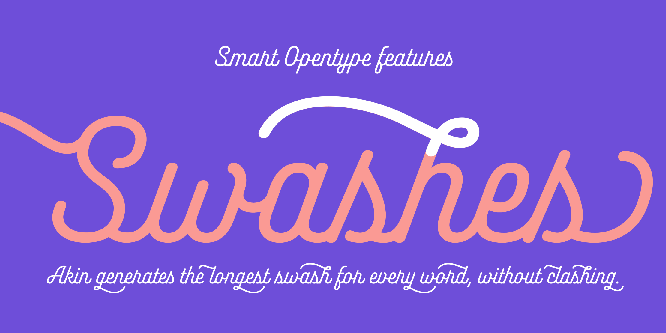
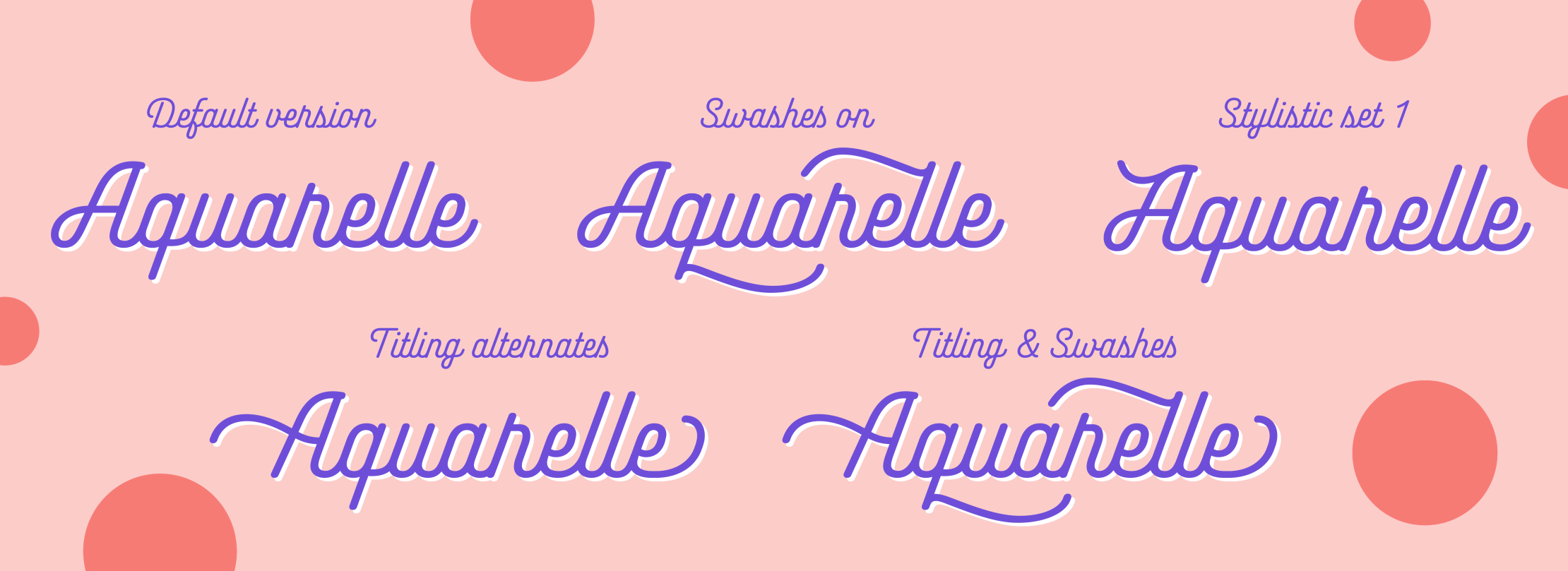
Like almost every good OpenType script font, Akin has a lot of alternates. The most prominent feature is the font’s swashes. Swashes of various lengths can be automatically applied via an OpenType feature that reads the surrounding characters – in both directions – and inserts swashes that sweep above or below two or even three other letters (the font knows better than to let its swashes collide with capital letters, ascenders or descenders).

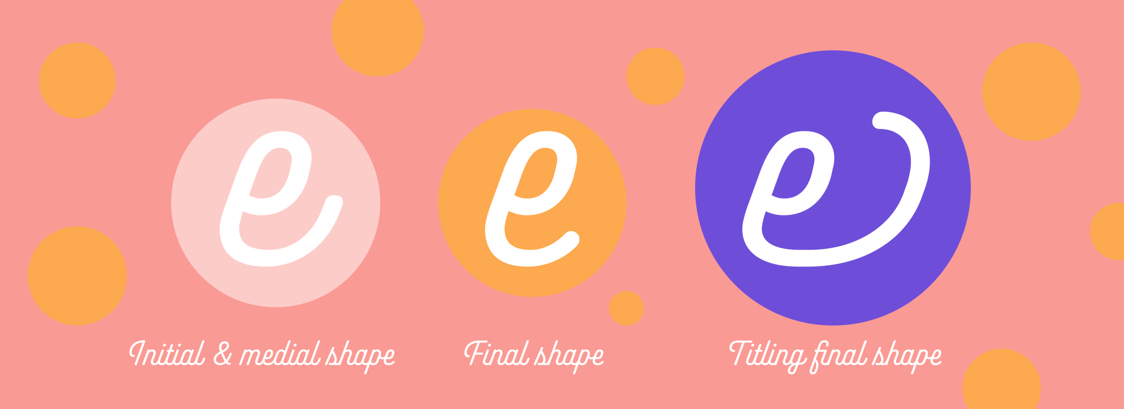
Another technical feature in Akin substitutes specially-designed ‘final’ glyphs in for letters that come at the end of a word. 
Mobirise
Mobirise
Mobirise
Mobirise
Mobirise
Akin supports all European languages written with the Latin script and is distribued by Indian Type Foundy or you can try it for free on Fontsand. Have fun!

hello@sabinakipara.com © Copyright Sabina Chipară

Web page was built with Mobirise